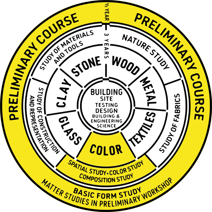
Color
The kingdom of colors has within it multidimensional possibilities only partly to be reduced to simple order. Each individual color is a universe in itself.1
The study of color at the Bauhaus was shaped by a diverse body of previously developed artistic, psychological, and scientific theories of color, tested and innovated through practical exercises. Johannes Itten’s reinterpretation of romantic painter Philipp Otto Runge’s color sphere (Farbenkugel) (fig. 29) formed the basis of color instruction in the Preliminary Course. Created in 1921, Itten’s color star (fig. 28) unfolds and flattens Runge’s sphere in order to display its dark-light polarities on a single plane. These poles, represented by the white center of the star and its black tips, contained between them endless possibilities for the study of contrasting color effects.
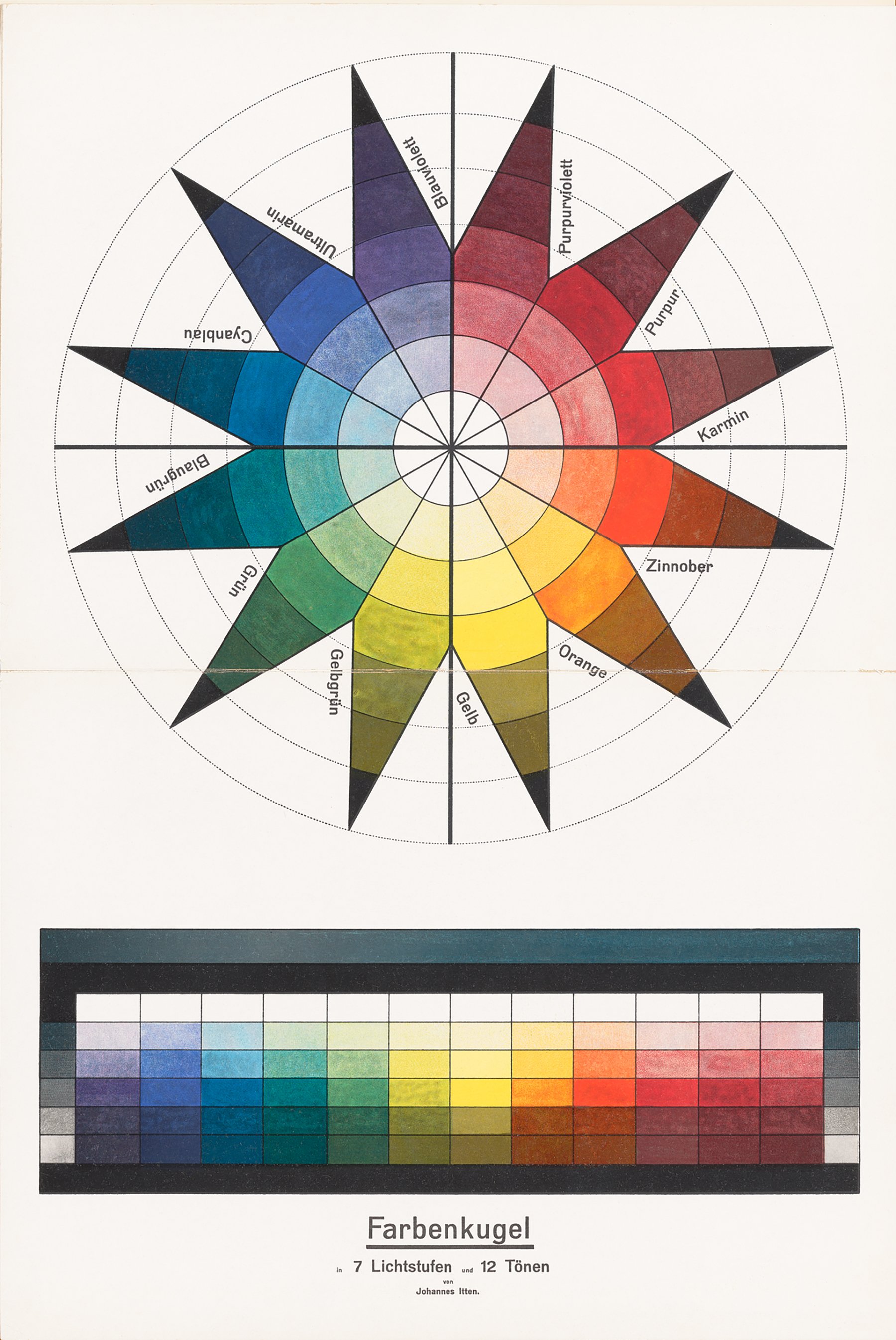 Fig. 28.
Itten identified seven fundamental categories of contrast: hue, light-dark, cold-warm, complementary, analogous, saturation, and extension. The color star modeled several of these. It featured six concentric circles, representing the surface of Runge’s sphere, with twelve “meridians” radiating from their circumference. Each meridian line dissects the center of the circles to hit its polar opposite in space, while an “equatorial zone” displays the twelve pure colors from a classic twelve-hue color wheel. Itten explained how the star could be used to study color contrasts: “Reading outward, we have the zones of tints, the zone of the pure hues [equatorial zone], and the two zones of shades, with black at the extreme points of the star.”2
Itten’s color star was just one among many variations on the standard color wheel that Bauhaus masters and students developed through pedagogical exchange. Paul Klee developed a theory of color that began with the line and led, through mutations in direction and acceleration, toward the color wheel. Vassily Kandinsky arrived at the Bauhaus already a renowned expert on color theory. His book On the Spiritual in Art established distinct emotional and spiritual associations between specific colors and forms. He theorized these associations as general artistic principles.
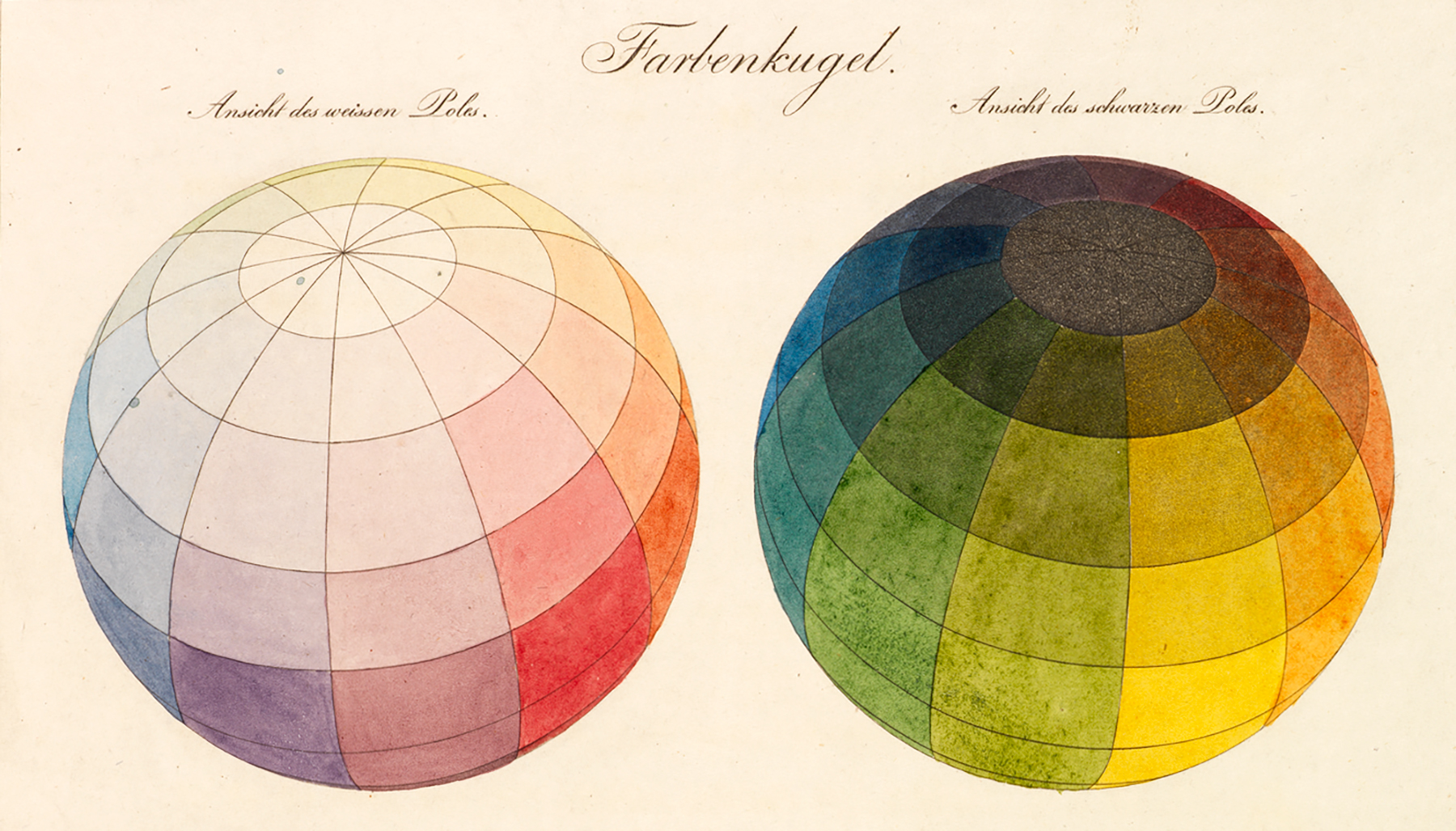 Fig. 29.
Unlike Kandinsky’s belief in an essential association between form and color, Josef Albers theorized color’s absolute relativity. Albers insisted that “color, as the most relative medium in art, has innumerable faces or appearances. To study them in their respective interactions, in their interdependence, will enrich our ‘seeing,’ our world—and ourselves.”3
Light and Dark
Johannes Itten encouraged exploration of color through contrasts and polarities, always urging students to feel their own way into an exercise. He observed that each student gravitated to a distinct category of contrast exercises, revealing deep-seated affinities between personality types and aesthetic choices:
Different talented people react variously to formal devices and develop differently in relation to them. Some respond particularly to light-dark contrasts, others to form, rhythm, color, proportions and constructions, textures, spatial orientation, or sculpture. In this way, I was able to recognize in each student a light-dark type or a rhythmical type, or even a metal, wood, or glass type.4
—Johannes Itten
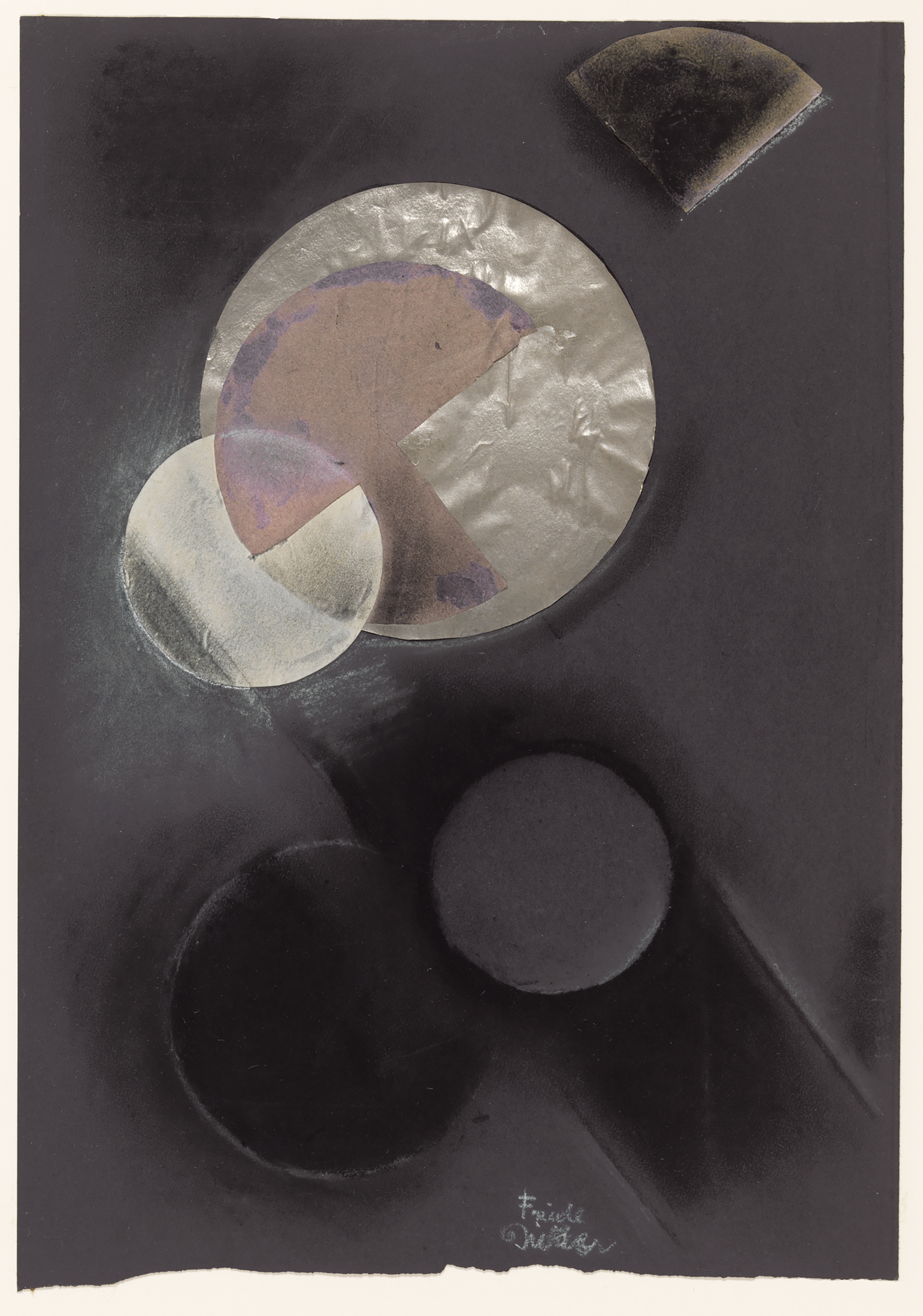
Bauhaus student Friedl Dicker’s composition is a study in light-dark contrasts. Placing the reflective surface of a silver disk at the center of the image, Dicker heightened its luminosity even further by layering a white circle over its lower left quadrant. This white circle finds its polar opposite in a black circle, whose outline was drawn by shading black chalk around the edges of a paper cutout. The two circles have the same dimensions but are polar opposites in color and construction.
Red, said Kandinsky, “is distinguished from yellow and blue by its characteristic of lying firmly on the plane, and from black and white by an intensive inner seething—a tension within it.
In Motion
Kandinsky defined the material surface on which the work of art is constructed as the “basic plane,” abbreviated “BP.” The square was the most typical form of the basic plane and corresponded to the standard shape of most painted canvases, while red was its most natural color pairing: red, as Kandinsky explained, “is distinguished from yellow and blue by its characteristic of lying firmly on the plane, and from black and white by an intensive inner seething—a tension within it.”5
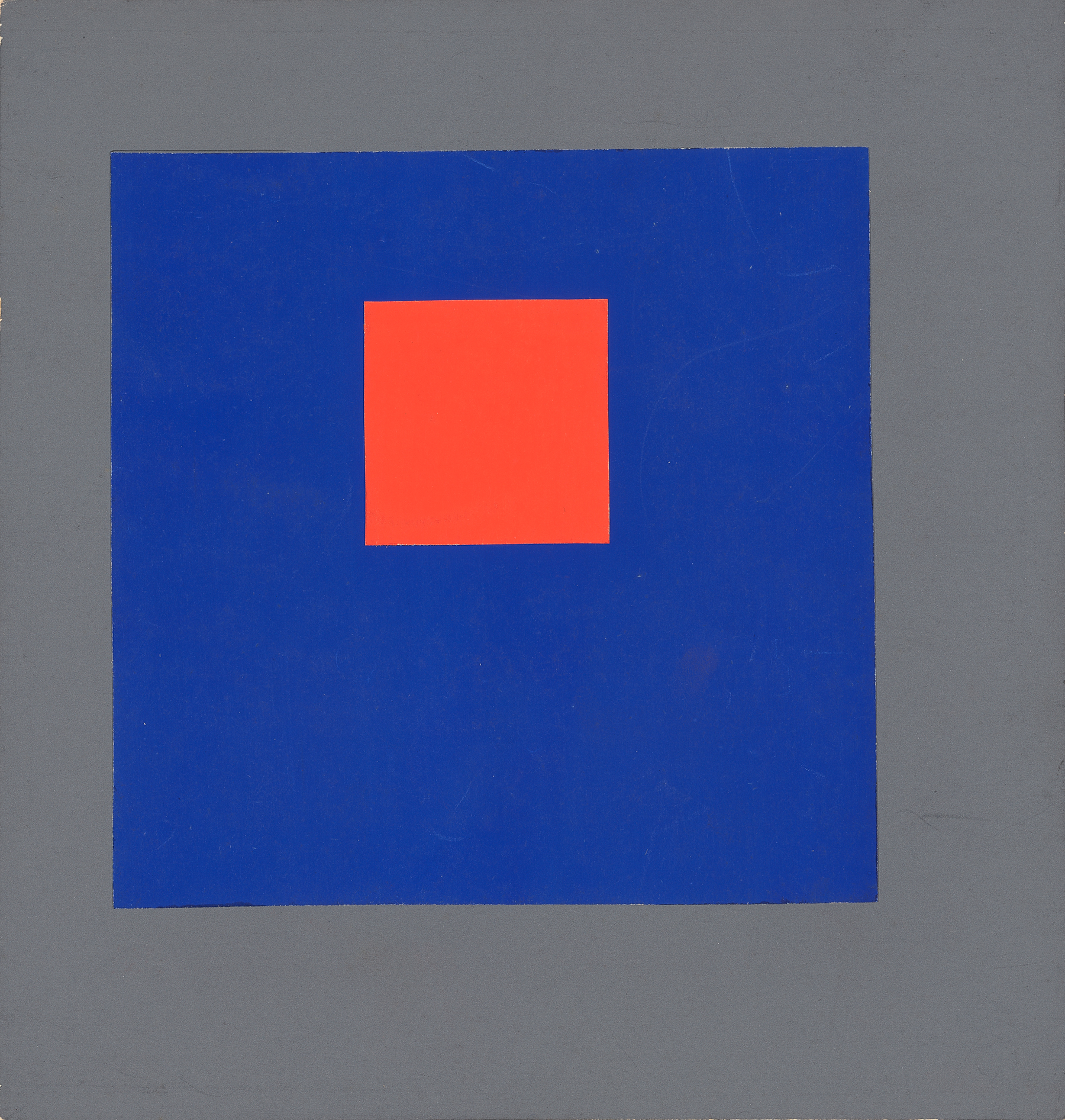
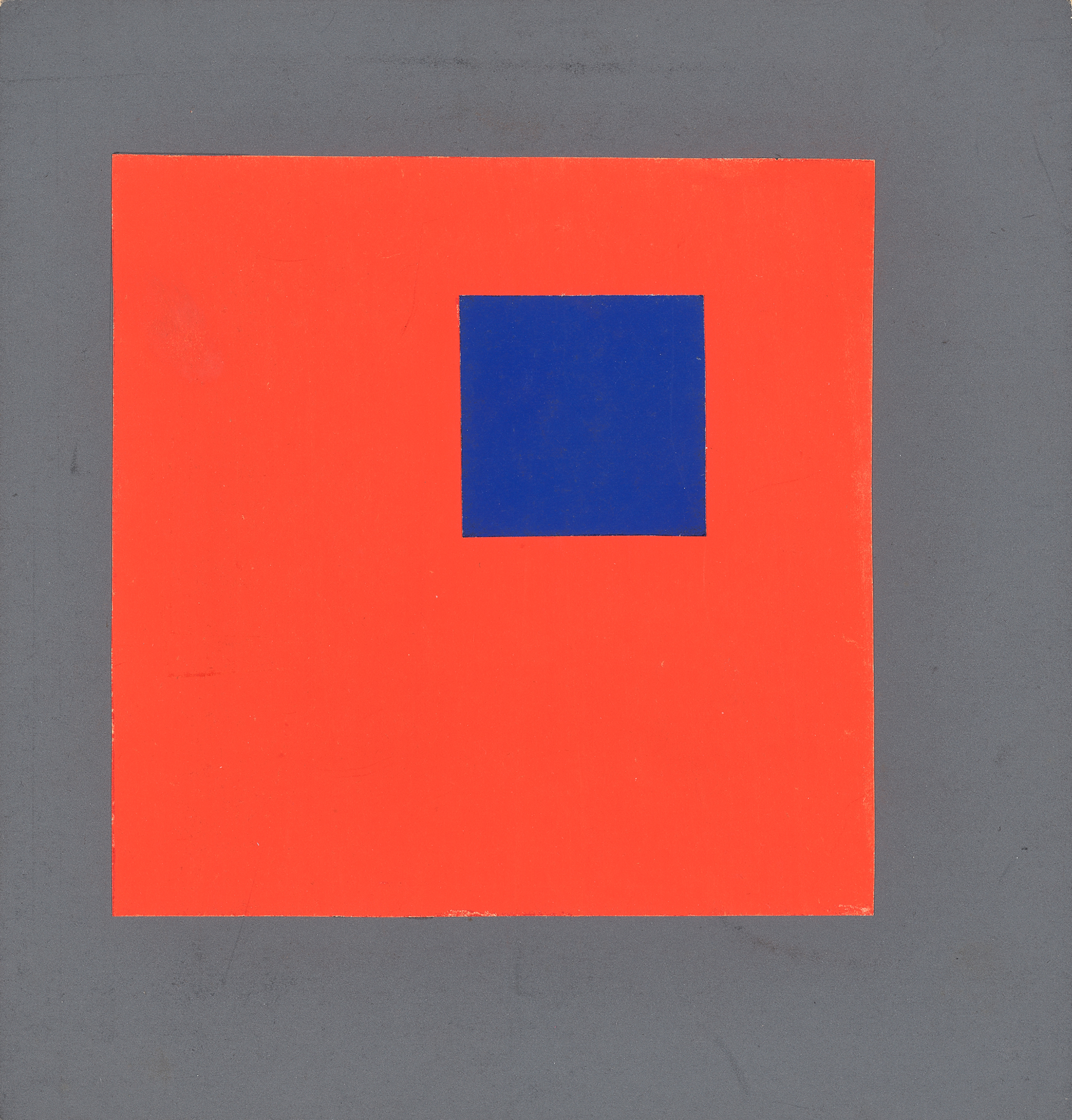
Erich Mrozek’s color exercises (figs. 31, 32) deploy a red square in two opposing compositions. In exercises such as Mrozek’s, “the recession and advance of the form elements draw the BP [basic plane] forward (toward the observers) and backward in depth (away from the observers) in such a manner that the BP, like an accordion, is pulled apart in both directions.” Kandinsky added that “the colour elements possess this power to a high degree.”6 Combined, colors such as red, blue, and gray produce variable effects that can be modulated with the addition of other colors.
Analogy and Equilibrium
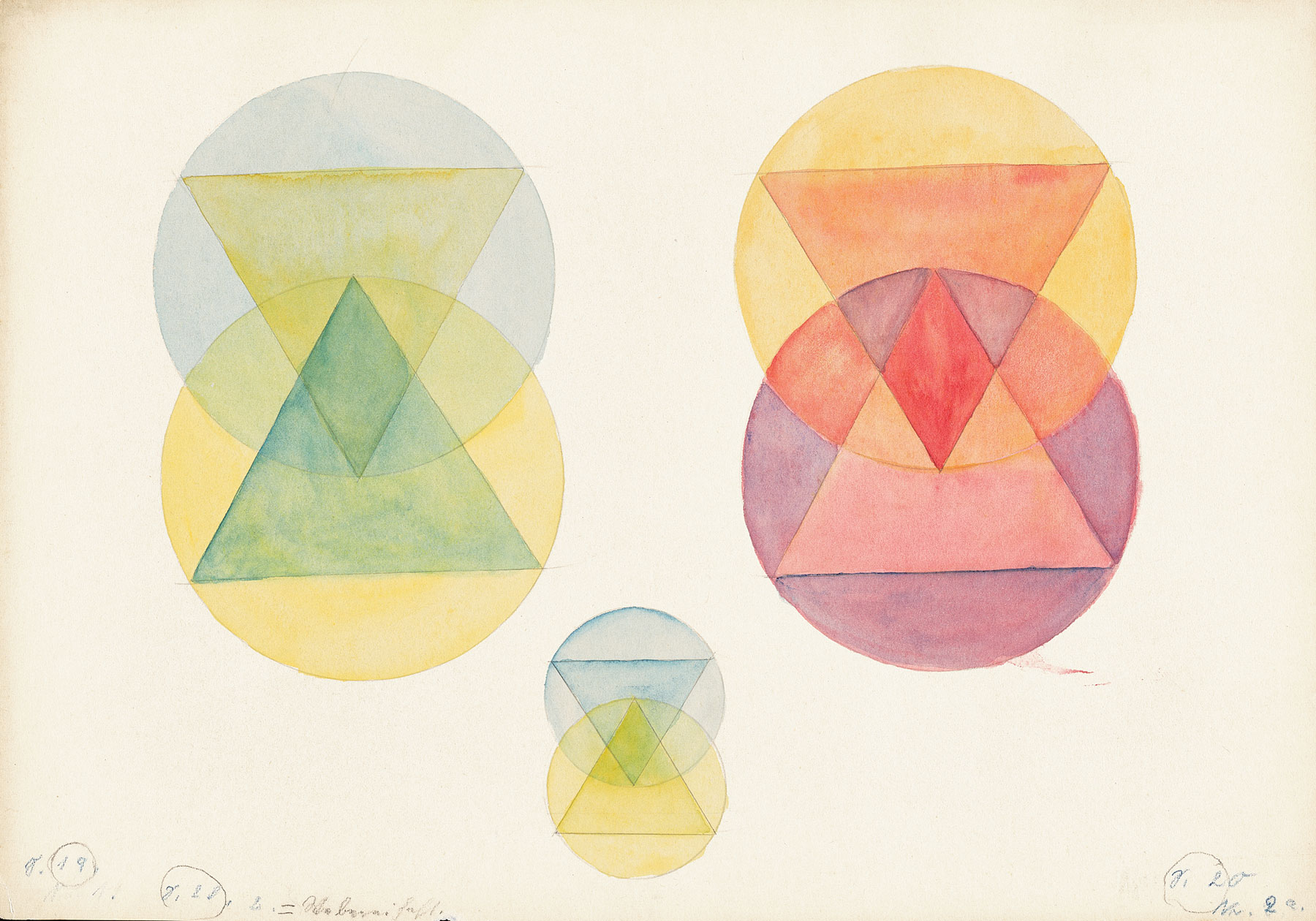
Paul Klee’s Design Theory class gave students in the weaving workshop in Dessau advanced training in the handling of form and color. A watercolor exercise by Margarete Willers (fig. 33) reflects Klee’s teaching on the subject of equilibrium. Unlike student Erich Mrozek’s compositions for Kandinsky’s class (figs. 31, 32), which featured primary colors, Willer’s composition explores colors resting next to each other on the color wheel, also known as analogous or tertiary colors.
For Josef Albers, “sight” signified not just the optical mechanics of the eye and the physical properties of light waves, but also the perception of inner states.
Overlapping planes of primary forms rendered in analogous colors such as red-orange, yellow-orange, and red-violet reveal that formal composition is an act of balancing. Each color has a different weight, which must be considered in relation to the composition as a whole. For weaving students, the overlapping planes of colored circles and triangles offered a theoretical framework through which to consider the craft of weaving thread into under- and overlapping threads of different or similar colors. Student notebooks from Klee’s design theory classes record detailed instructions leading up to the execution of this exercise, elaborating a complex system of numeral-color correspondences used to map balance and rhythm.
Opacity and Transparency
For Josef Albers, “sight” signified not just the optical mechanics of the eye and the physical properties of light waves but also the perception of inner states. Combined, these different ways of seeing formed one’s view of the world, which the master considered to be highly subjective.
“If one says ‘Red’ (the name of a color) and there are 50 people listening, it can be expected that there will be 50 reds in their minds. And one can be sure that all these reds will be very different.7
—Josef Albers
In order to cultivate this type of vision, Albers assigned “free studies,” which actually had strict parameters. Students might be tasked with the challenge of using only four colors to produce multiple effects. Albers insisted that such restrictions nevertheless led to “an incredible variety of independent work as rarely happens in classes whose students are exposed only to so-called self-expression.”8
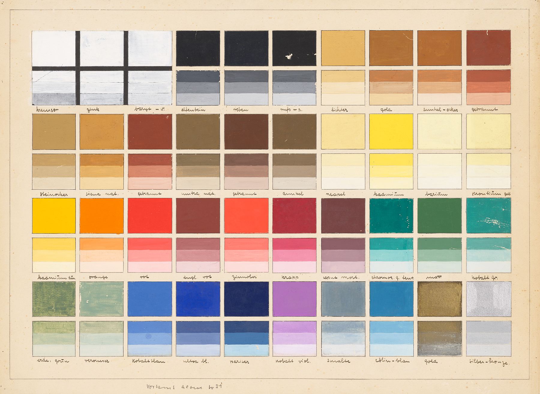
An exercise by student Heinrich Bormann (fig. 34) demonstrates the manipulation of color perception to achieve transparent or opaque effects. Featuring the darkest color on top and lightest on the bottom, each square pairing shows a progression from opaque to transparent. The final band of each lower square is the most transparent, while the pure color above remains the most opaque. These designations only make sense if one imagines an actual painting: when the whitest hue is painted over a plane covered in the darkest hue in a pairing, the eye perceives a transparent veil or piece of paper resting on the surface of the image.
Notes
- Johannes Itten, The Art of Color (New York: Reinhold Publishing Corporation, 1961), 117. ↩
- Ibid., 114. ↩
- Josef Albers, Interaction of Color (New Haven: Yale University Press, 1971), x. ↩
- Johannes Itten, Mein Vorkurs am Bauhaus (Ravensburg: Otto Maier Verlag, 1963), 10. (German translation: Verschiedenen begabte Menschen reagieren ganz unterschiedlich auf die Gestaltungsmittel und entwickeln sich entsprechend verschiedenartig. Die einen sprechen besonders an auf das Hell-Dunkel, andere auf die Formen, den Rhythmus, die Farbe, die Proportionen und Konstruktionen, die Texturen, die Raumrichtungen order die Plastik. So konnte ich in einem Studierenden einen Hell-Dunkel-Typ sehen oder einen rhythmischen Typ oder auch einen Metall-, Holz- oder Glastyp erkennen.) ↩
- Wassily Kandinsky, Point and Line to Plane (New York: Solomon R. Guggenheim Foundation, 1947), 65. ↩
- Ibid., 124. ↩
- Josef Albers, Interaction of Color (New Haven: Yale University Press, 1971), 13. ↩
- Ibid., xiv. ↩