Incredible in his range, Bernard Rudofsky designed buildings and books, fabrics and footwear. For Lessons from Bernard Rudofsky, exhibition designers and curators faced the challenge of creating a space that would capture Rudofsky's ideas and unique style.
In his own exhibition designs, Rudofsky created dynamic spaces with juxtaposed images and words to disorient visitors, question the status quo, and suggest new ways of thinking about architecture and design. In developing the installation, curators Wim de Wit and Christopher James Alexander and exhibition designers Everett Katigbak and Leon Rodriguez embraced Rudofsky's approach.
Katigbak and Rodriguez began by taking the exhibition's title to heart. "The title of the show—with the word lessons—was the guiding idea for us. We really wanted to study Rudofsky's methods for communicating ideas in an exhibition format and apply what we learned from his work to this installation," says Katigbak.
To that end, Katigbak and Rodriguez delved into the work of Rudofsky. They read Rudofsky's essays about design and found images of Rudofsky's own installation designs. They studied his architectural plans and the many photographs he took during his travels. The goal was to let the form and aesthetic for the exhibition emerge from the content. As Katigbak describes it, "We really had to get back to our design roots."
|
 |
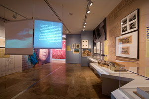

The broad array of Rudofsky's artistic production—architectural models, photographs, drawings, writings, fashion and textile design—are all incorporated in an installation that transforms the Getty Research Institute's gallery. |
The challenge for the designers was twofold. First, they had to fit many different kinds of objects—books, architectural plans and models, photographs, sandal designs, textiles, sculptures, and video projections—into the small gallery space at the Getty Research Institute (GRI). Second, they needed to make clear that these were all created by the same person. Going back to Rudofsky's own approach, the designers chose to construct a layered installation.
The foundation layer is composed of large murals of photographs and architectural plans that cover the walls from floor to ceiling. Objects such as books, sculptures, fashion designs, and drawings are hung on the walls, directly over these mural images.
The small size of the gallery at the GRI was a mixed blessing for Katigbak and Rodriguez. With the directive to embrace new ideas and a limited space, they started out into the lobby area outside the actual gallery and up into space above visitors' heads. Visitors to this exhibition, especially those familiar with the GRI's exhibitions, will encounter surprises upon approaching the space. In addition to a screen of Bernardo sandals, they will see objects that will make it clear right away that the exhibition is not only about architecture and design, but also about fashion, comfort, and body image.
Rudofsky sought to create engaging exhibitions by taking visitors out of the expected. "Most museum visitors are repeaters," he wrote. "It is very important that they get new, fresh impressions every time. The highest compliment for an exhibition architect is when somebody says, 'I don't recognize this place.'"
| |
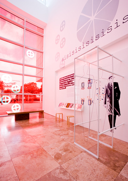
The experience of the exhibition begins in the lobby of the GRI, with red window gels, a reading area stocked with Rudofsky's books, wall graphics, and a reconstruction of Rudofsky's Sixty-four Buttons and Twenty-four Pockets
Adorning Western Man's 1940s Business Attire. |